Behind the scenes in Los Angeles
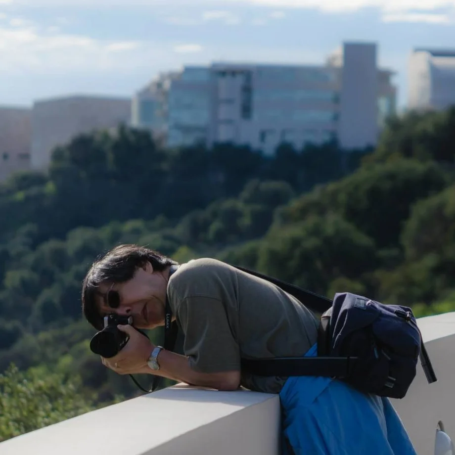
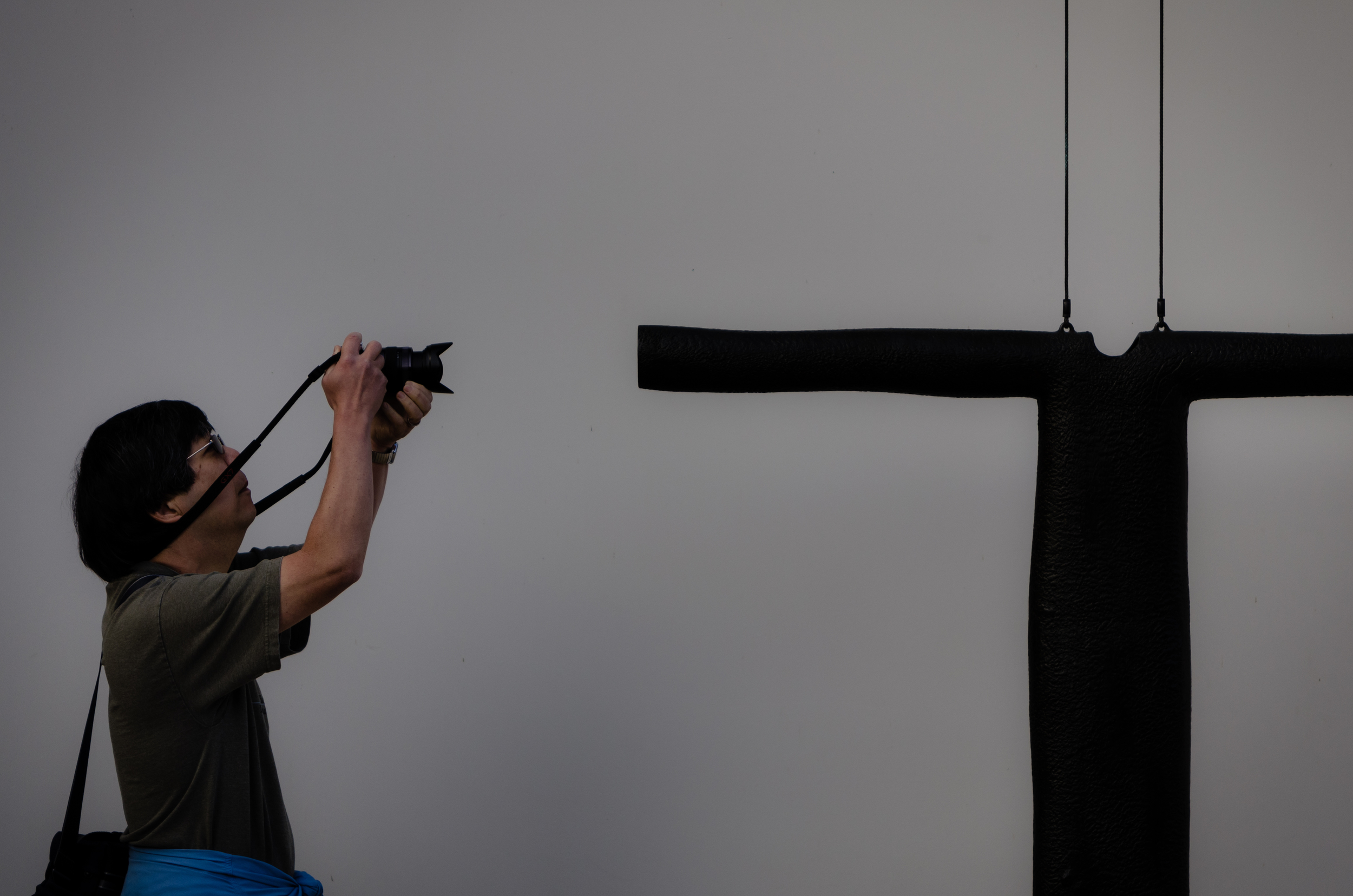
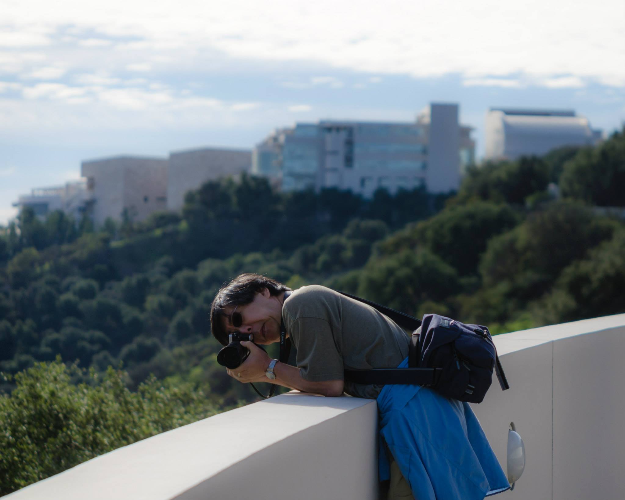
While we were in the Los Angeles area last month, Kellen, Noël, Melody, and I did a lot of playing tourist, which involves a lot of taking pictures. Kellen took a few of me, and I thought I'd take the opportunity to show his photos, what I was photographing, and say why I eventually didn't decide to use the shots.
Bronzenightshirt
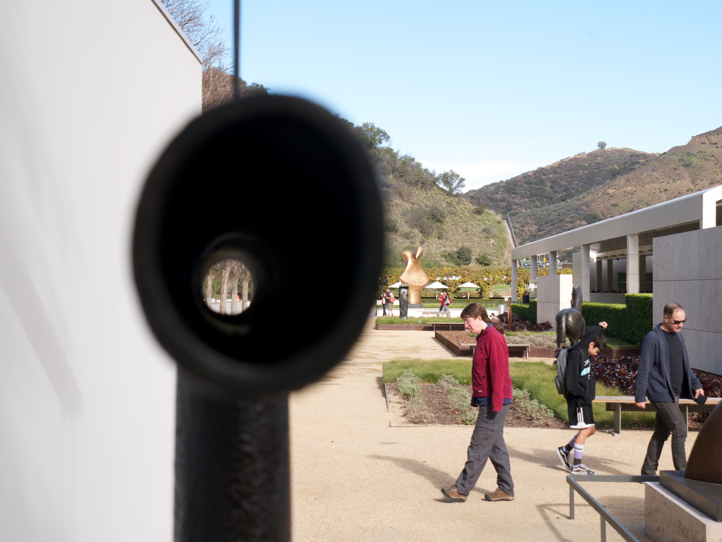
This sculpture by Peter Shelton is in the sculpture garden near the garage at the Getty Museum. The top crosspiece is hollow, so I wanted to try taking a photo looking through it.
As you can see, the sculpture was just a bit high for me, so it took a bit of doing to get a look through, as well as getting the camera level. Here's what I ended up with out of the camera:
Once I grabbed the shot, I took a look at what I had to see if I wanted to try shooting more frames. However, I didn't feel there was enough continuity between what you see through the hole and what's around the sculpture. Since I'm talking about things behind the scenes, here's how I would have edited the photo (although I would have tried a few more frames to get various backgrounds):
I've been cropping landscape pictures to 2:3, so that's where I would have started. The visitors on the right are gone, to reduce distractions. That also allowed me to crop vertically to make the sculpture more prominent, make it act as a divider between the wall and the rest of the image, and to move the hole away from the middle of the frame.
Path along the Getty Museum tram
Instead of taking the tram between the garage and the museum, we walked along the path. I took the opportunity to grab a few shots along the way.
I was shooting along the track, resulting in this:
I was trying to get the feeling that there were three forms of transit in view: walking, the tram, and the freeway. The image didn't make the initial cut when I was sorting at the end of the day, however, because I couldn't find a good story to go with it. The hedge is too prominent, the arrangement of cars looks very strange, and I would have wanted something of Kellen other than him looking at the image on his camera that he just took of me. However, were I to want to use this frame, here's one way I would have gone:
For portrait images, I've been cropping to 4:5, which is what I did here. It allowed me to get rid of some of the foliage at the bottom, so it's a bit less prominent. I also cropped in on the left so the people are right against the edge of the photo, which gives the feeling that there could have been more people there (and let me crop even more off the bottom). If there were just the hint of a tram, the picture would have been much closer to me wanting to use it.
Getty Museum Entrance Hall
I took lots of photos in and around the Entrance Hall, since it was so interesting. I tried different angles, crouched down to look up, and here, went to the top of the stairs to look down.
This is one of the shots I ended up getting, straight out of the camera:
I was using an ultra-wide-angle lens, which is why I was able to get so much into the frame. The lighting was difficult, so I exposed for the middle-highlights, figuring I could bring up the shadows when I edited. I also happened to be in aperture priority mode (left over from shots I was taking a bit earlier) so this ended up being f/22. Not what I would have wanted, but it ended up being OK.
I like the bit of stairway at the left, but the ceiling ended up being a bit more skewed than I would have liked, since my position wasn't square to the panels (they were squares). I do like the wraparound feeling given by the curves in the middle, however, although they look a bit off kilter to me; my camera has an electronic level, so I know I was pretty close, but even though the center pillar is vertical, the window edge at the left is a bit off. I also feel there's a bit too much curve on the right.
Here's a shot at processing:
This rendition pretty much addresses each of the points above. I cropped the left just enough to get rid of the off-vertical line, to the right so the curves look balanced, and off the top to make the ceiling windows look less strange. I also lightened up the shadows, as well as the image as a whole, to give it a more open feel.
Looking at the edit, I like the result better than I thought I would. How about that.
Hollywood sign
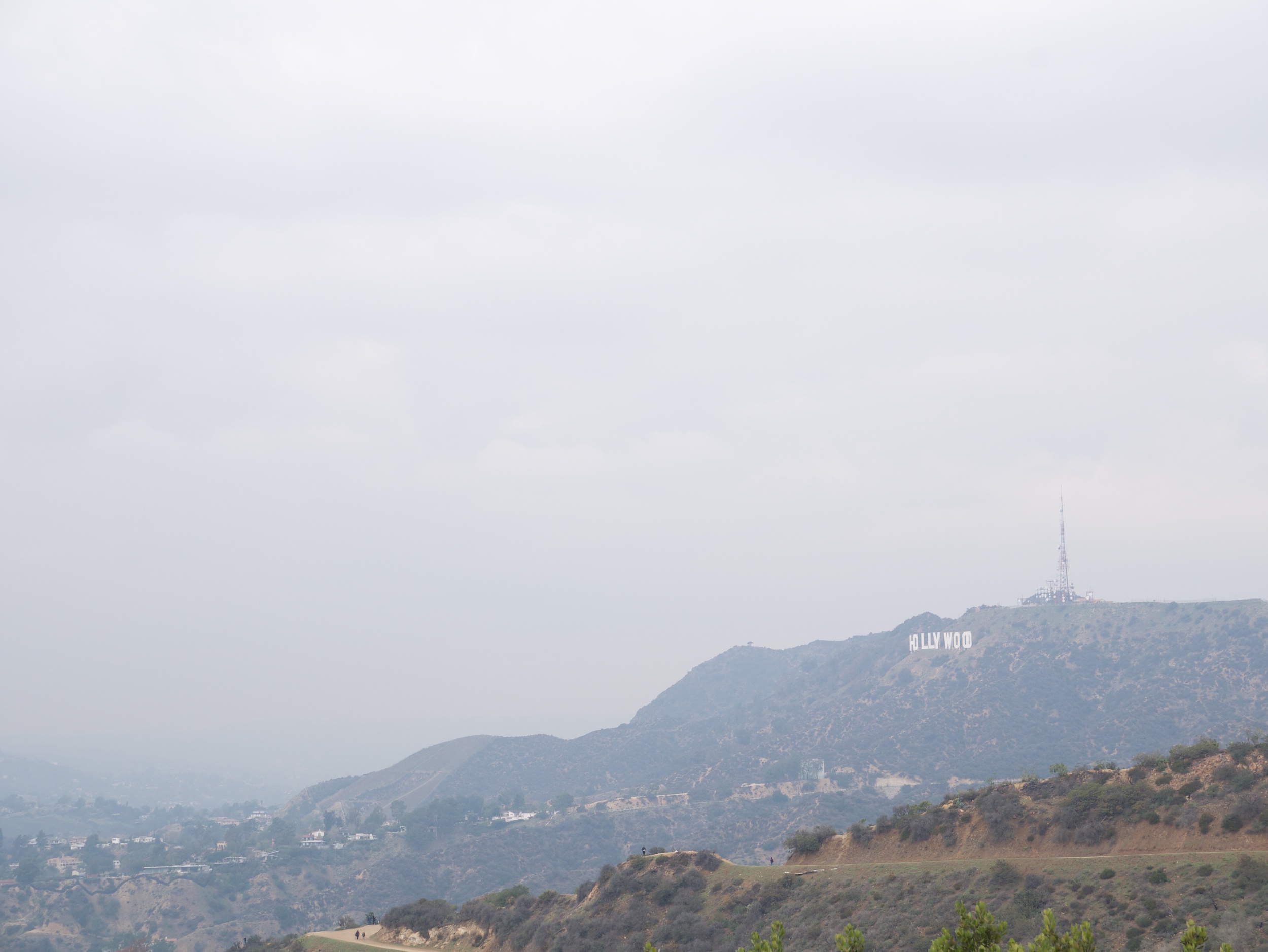
On a different day we walked up the Mt. Hollywood trail, and got good views of the Hollywood sign along the way.
And here's the shot out of my camera:
Pretty nondescript. I knew I had shots from many different angles, this being one of them, but I ended up liking other ones better. I was trying to emphasize the sky here, but there's just so much haze, it ended up being less interesting than I had hoped. But here's an attempt to see what I can do with it:
I once again did some generous cropping here, to lessen the emphasis on the sky. I also boosted the contrast a bit further than I normally would have (which is why the foreground looks a bit unnatural) to bring out as much as I could around the sign. If I were doing more with the image, I would reduce the contrast a bit on the foreground, but probably wouldn't be able to boost the rest any more. I also warmed the image a bit to try to get a bit more texture in the sky.
Lindenberg memorial
There's a sign commemorating officer Jeffrey B. Lindeberg who was killed in the line of duty in 1976. Thought I'd try to tell a story with it.
In case you're wondering, the cable coming out of my camera bag is from a battery I'm using to charge my phone. Since I use the GPS to track my location so I can add it to photos later, I like to make sure my phone doesn't get fully discharged by the end of the day.
While I'm holding the camera horizontally, I did switch to vertical before I actually took the picture. Here's what I ended up with:
Much less than I was hoping for. At least I'm having fewer contrast problems than in the previous photo. However, there isn't much I was able to do with it to make it a more compelling image:
Even though the contrast wasn't too bad, I boosted it a bit anyway to make the sky more dramatic. I also cropped to make it look more like a mound, rather than having all the flat area on the bottom and left. I also think the pole may have been slightly off vertical, so I rotated the image a bit. Cropping in also makes the text on the sign a bit larger, giving the viewer more of a chance to read it. Still too small, however.
Different than my normal workflow
You'll notice a common thread in the photos above, mostly that I was quite liberal with cropping and boosting contrast. Mostly that was because these are photos I decided to not use, so I took further measures than I normally would to try to get something out of the shot. I usually spend at most a minute or so processing each photo, and even then only that much time on shots I do more work on; mostly it's a crop, a quick levels adjustment, perhaps a white balance tweak or noise reduction, and finally light sharpening.
You can see from above that I normally use two hands (one below the lens) and use the viewfinder. The camera I use now is the first one I've ever had which has rangefinder styling, but I find it works just as well as a camera with a centered viewfinder. I also seem to be backwards from most people, turning the camera clockwise for verticals (so my right hand is underneath the camera); I feel more secure holding the camera that way. Of course, on the tram line photo above, holding the camera vertical the other way would have been quite awkward.
You'll also notice that I've got some sort of coat wrapped around my waist in each shot. My mom would claim I never wear a coat; I definitely had more shirtsleeves time than Melody, Kellen, or Noël, but I did use the coat. I am, after all, not a polar bear.
