Photo triage
When I take photos, a lot of thought goes into technical and artistic details, but I put at least as much work into selecting which shots to publish. Only after that's done do I edit the images themselves. That triage process will usually result in the same set of photos no matter when I do it, but my particular style at the time has a large impact over whether a particular shot gets thumbs up or thumbs down.
I found the article by White House Photographer Pete Souza's article, Behind the Lens: Somewhere Under the Rainbow an interesting look into how someone else goes through the process of picking the right image out of several. He shows several images, describing how he and a colleague worked to position themselves to where they think would be a good vantage point.
The image he ended up using of President Obama's hand and arm perfectly positioned with a rainbow, but more fascinating to me was how he talked about the previous two shots from under the wing of Air Force one. At first blush, they look the same, other than the President being in a different place on the stairs. However, you can see that the sun is illuminating him on only one of the shots, in a way that's even better than the final image. The impact of a photo is more than just technical details, however, and the wave in the rainbow ended up telling the best story.
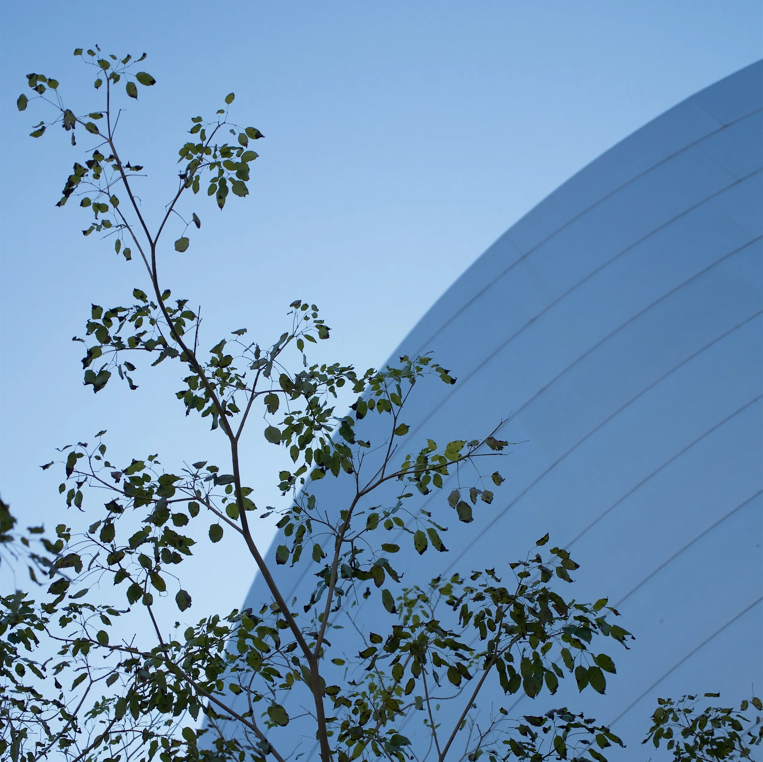
When Melody and I were in Southern California, we spent a bit of time at the Walt Disney Concert Hall, which has interesting shapes and angles from all around. When we got to the public garden, I wanted to get a shot with some foliage in front of the building. I didn't take very many shots, but as I was moving around, I found a composition I liked and took a few images just of that.
Looking at the images on my computer, I thought they all had interesting points, and ended up processing three photos, one of each composition.
The top left image was interesting because of the building, but that also made it more complex than I was looking for. I liked how the space between the trees made an S-shaped form which mimicked the lines of the building's tiles. However, the tree on the right didn't quite feel right, since you couldn't see the overall shape of the tree. Yes, I both liked how its shape was positioned and didn't like the shape. I did like it overall, however, and I cropped the bottom off, so the tree looked less abnormal.
The top right image didn't feel very interesting to me. The building is pretty much centered, and the trees look pretty jumbled. It kind of reminded me of Yosemite's El Capitan, however; I went ahead and processed the image.
The most interesting part of the selection was the last three images, which are mostly the same, but at the same time, different.
Technically, of the images on the second row, I like the image on the right, because the building has an ever-so-slight blur to it due to the wide-open aperture. That was only one factor for me to weigh, though.
The middle image was an attempt to have the tree going through the frame, rather than stopping part way; I decided it was too distracting, especially since it looks incomplete since you can tell just the tip of the branch is out of the frame. I could have cropped a little off the left to hide that, but when I triage photos, I also don't plan on doing a lot of editing unless I see something worth the effort.
The left image is distracting, due to both the part of the building in the background and the density of the foliage. The tree also takes up more of the frame than I liked. Also, the tip of the tree was a bit too close to the top of the frame.
I ended up using the image on the right since it didn't really require a lot of editing. I crop to a 5:4 ratio (rather than the 4:3 of the original) which moved the tree very close to the diagonal and the branch bisects the angle (going in a line from the top left corner to the middle of the bottom).
While I ended up processing the three selected images, I chose the last one for posting in the most places, since it had the most things working for it.